#COVIDRiskChart


We designed this chart in partnership with Dr. Trisha Greenhalgh, Prof. of Primary Care at the University of Oxford.
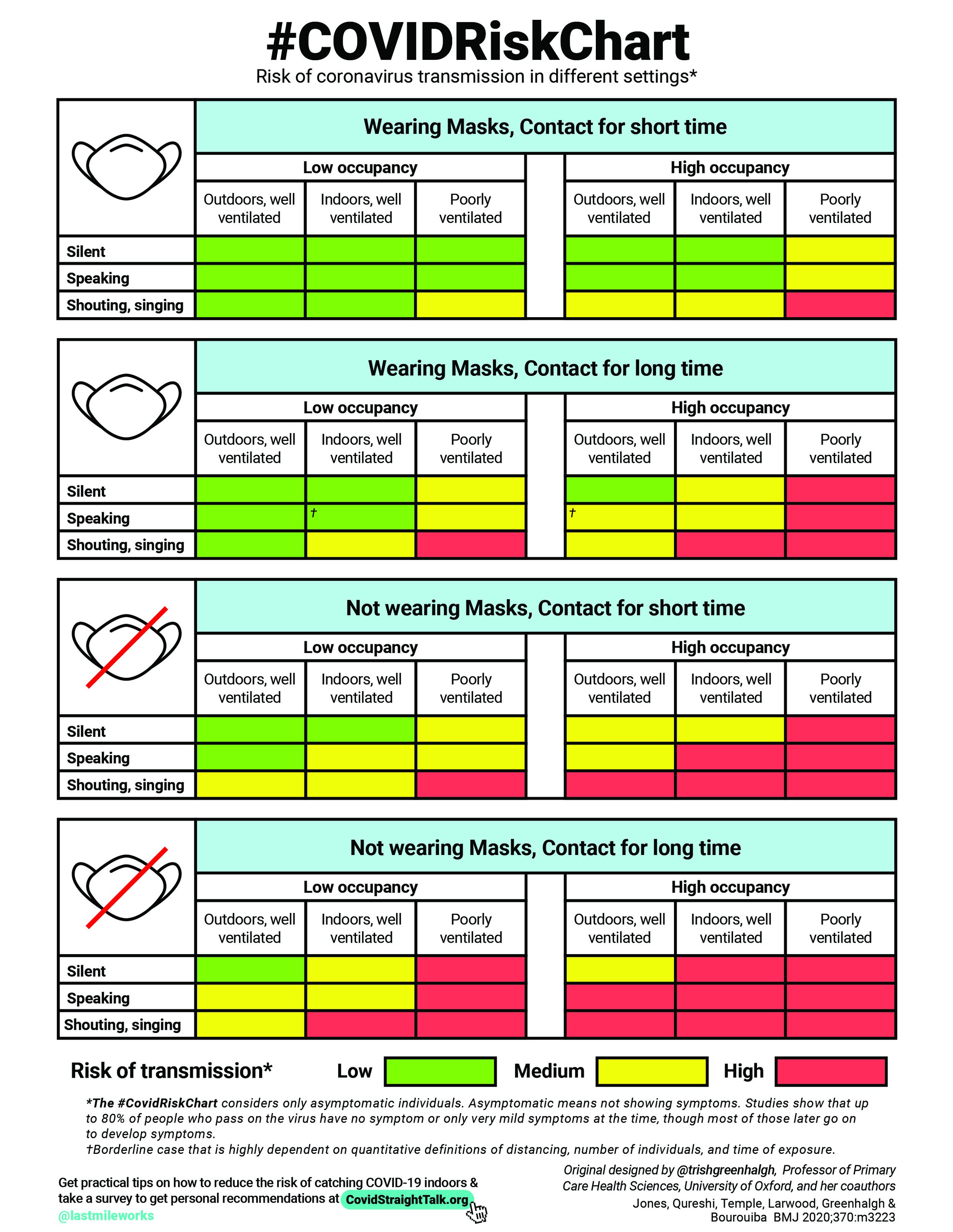
It is adapted from a table that originally appeared in her publication, “Two metres or one: what is the evidence for physical distancing in covid-19?” (2020), which she co-authored with Nicholas R Jones, Zeshan U Qureshi, Robert J Temple, Jessica P J Larwood, and Lydia Bourouiba.
The paper provides a framework for estimating the relative transmission risk associated with different activities under various conditions. In other words, “green,” is used to indicate a lower risk than “yellow,” which symbolizes lower risk than “red.” It’s important to note that the risk ratings of particular activities and conditions refer specifically to the risk of transmission from asymptomatic people, the presence of symptoms would likely exacerbate the risk in each of these cases. Additionally, personal circumstances such as the viral load of an infected person, an individual’s susceptibility to infection, and coughing or sneezing due to irritation or allergies while asymptomatic, could also increase the risk of transmission.
→ Click here for the COVID Straight Talk Adobe Illustrator file of the #COVIDRISKCHART to turn it into another language.
Once you make it, let us know on Twitter or email us so that we can add it here.
The #COVIDRISKCHART in 34 languages
When Dr. Trisha Greenblagh first published her #COVIDRiskChart on twitter, individuals around the world helped translate the chart into 34 languages. Here are the files below based off of the early iteration of the chart as word documents.
English—refer to the COVID Straight Talk updated version